Pipefy
Building a design system and enabling product experimentation
When
In progress since
Jun. 2018
Role
Product Design Lead
Live on
pipefy.com
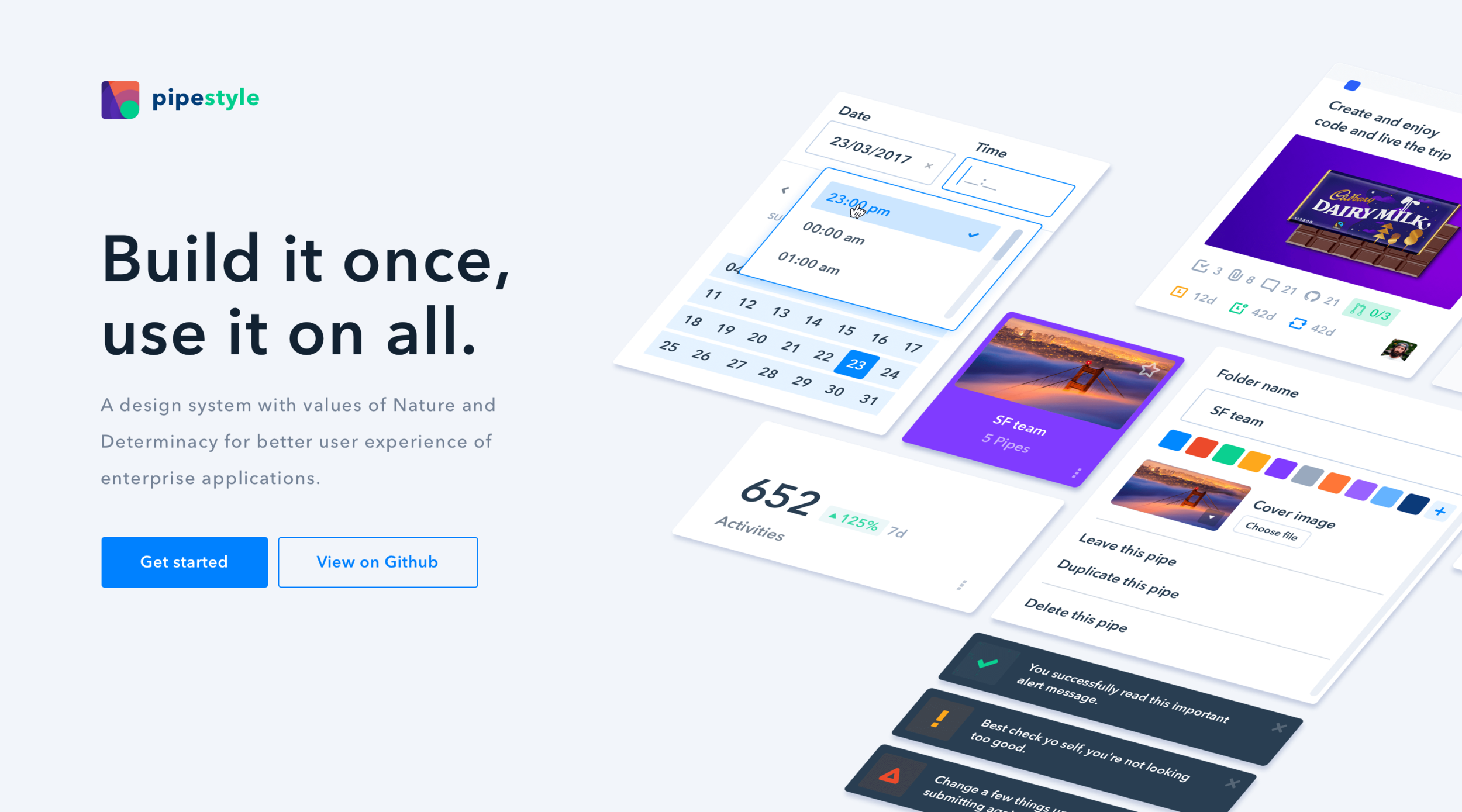
pipefy.style
Stack


What's Pipefy?
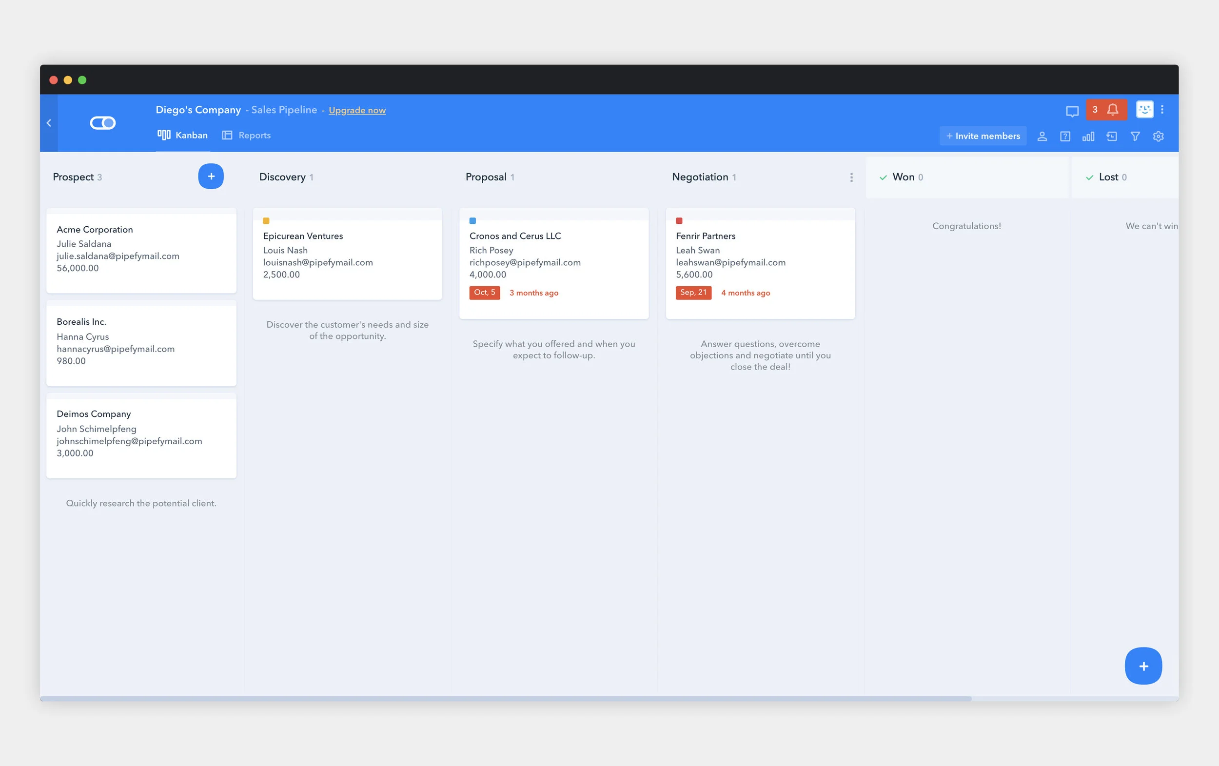
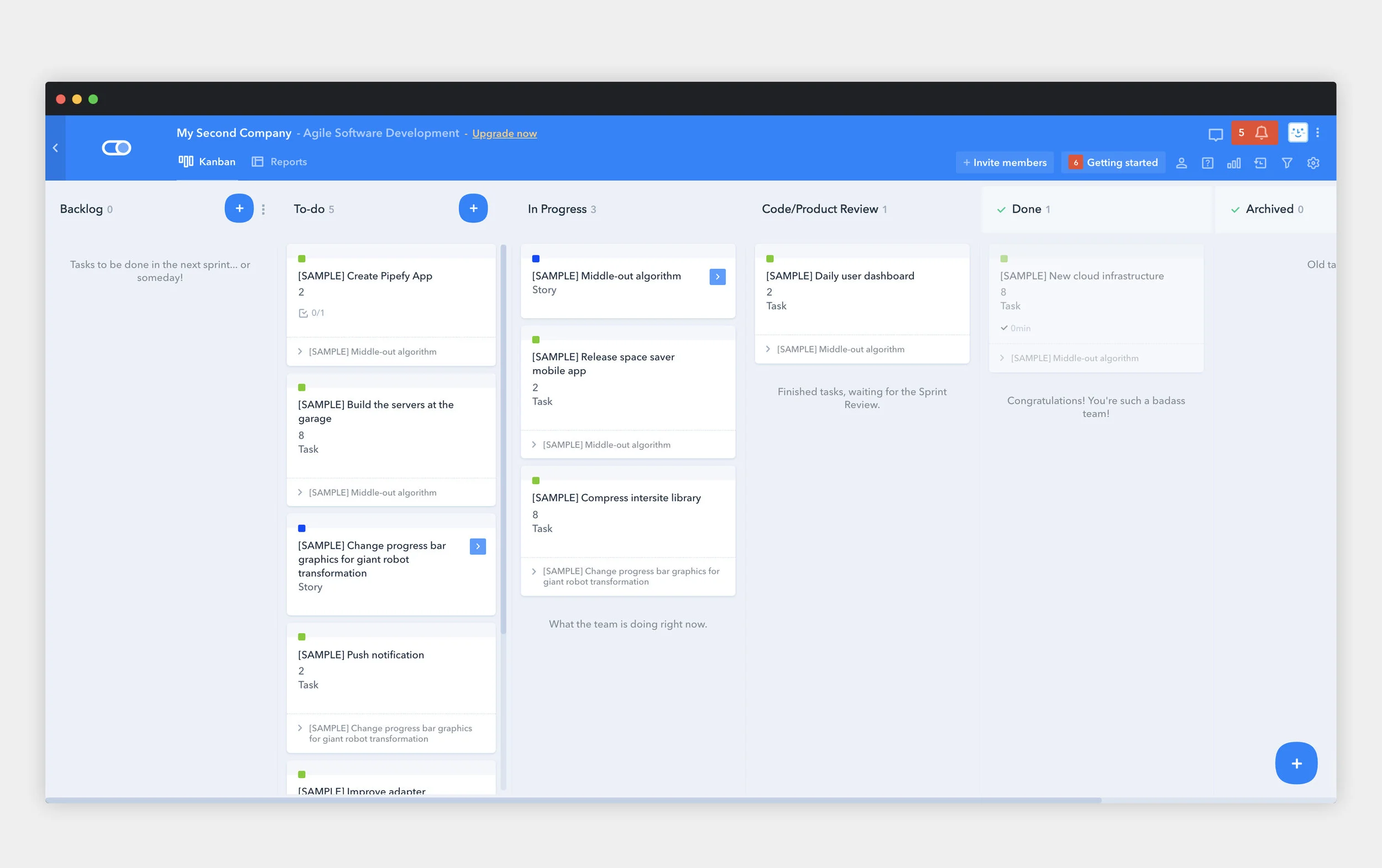
Pipefy is a lean management platform that empowers managers to build and execute any type of workflow. Through a simple Kanban-style interface, companies can achieve process excellence without the need for IT, technical skills or professional services. Currently with offices in San Francisco, Austin, and Curitiba (Brazil). Pipefy is the weapon of choice of many teams and managers at companies like Santander Bank, TEDx, Accenture, Capgemini, IBM and more.

Current scenario
Pipefy's ARR, the company's most important business metric, has been growing at a 3x pace in the last two years, and a relevant percentage of this growth relies on closing enterprise deals, but this comes with a cost, product complexity. Big customers usually means committing with technical and security requirements that may compromise R&D team's capacity by shifting the focus of improving the Pipefy experience to shipping complex features to complex use cases.
Therefore, in order to achieve the 2019 goal (20MM ARR), and the long term goal of 300MM ARR in 5 years, with full autonomy on product roadmap and not compromising the product experience due to a high complex product, design and product teams must focus a great part of their capacity in activating more and more users.
To drive activation rates up, it's mandatory for us to understand the journey first steps of users in Pipefy. How can we make users understand the power of the platform faster? How can we provide a good first time user experience and make user stick with us longer (and become paid users)? Well, we can experiment, so we developed the Pipefy's experimentation framework.
And to enable design team to focus on learning, by researching and shipping fast consistent experiments, we developed in parallel the first version of Pipefy's Design System, Pipefy Style.
Pipefy Style
Design system to scale design team power
The Experimentation framework would require Product Design team to ship fast and meaningful experiments, and hopefully more value in the form of new features, UX improvements etc from the validated ideas from these very same experiments. To make it possible and to enable designers to dedicate most of their capacity on researching and learning about the business and its users, design and front end teams joined efforts in developing Pipefy Style, the company's design system.
Product, engineering and design leaders teamed up to define the project attributes and scope, to forecast the benefits of investing time on it from various standpoints and the time availability of members in developing. It was crucial to have all stakeholders buy-in so we could run the project with the needed support.

"Despite expected UI inconsistencies, exact same components were behaving differently in different parts of product. We took advantage of the opportunity for auditing the platform and define design principles for Pipefy, those principles would guide the design system development work, help to improve design process and deliverables."
Defining a way of sharing and versioning
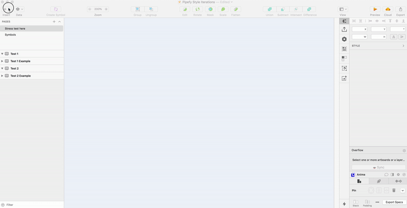
To keep design team synced and updated with the right set of components to work with, it was necessary to define a file version and sharing system, for that we adopted Abstract app and the typical engineering workflow with opened branches, committing changes, design review by peer designers and merging updates to master file. A single component library (an exact reflection of React components on pipefy.style) is shared throughout all design files. Abstract is also used as the hand-off interface between design and front-end team.
Auditing, building components and development
Example of inconsistent behaviours found on the platform audit. Label selectors were displaying different flows in different features of the products.
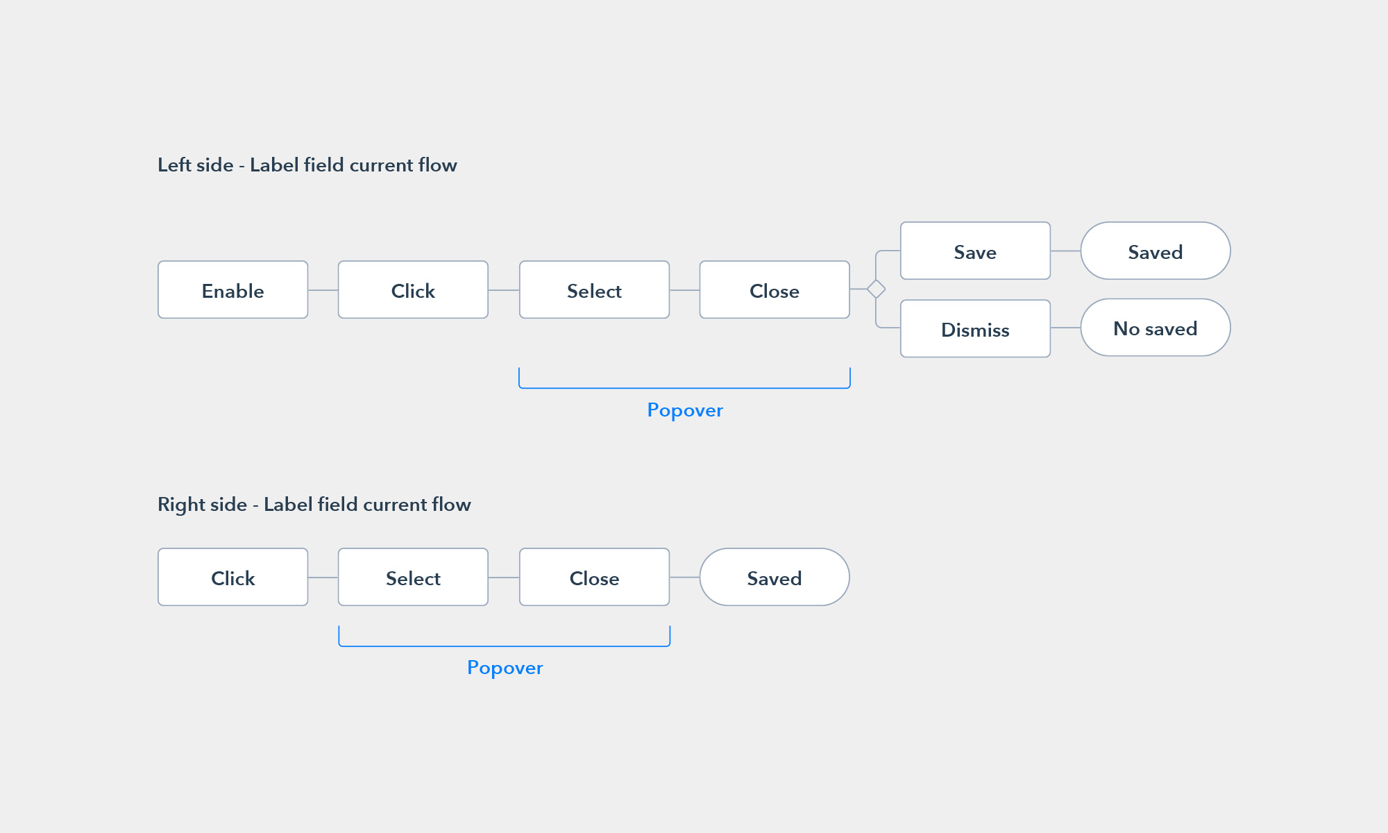
With all the needed resources, it was time to sit down and work hard on components, this was tackled under the premises of atomic design, although we simplified the lower levels of "atoms" to keep our symbols tree easy to use. Finite state machine tables were important in order to forecast all possible states for each component, also usability tests were conducted inside design team to collect feedback of how design team would actually consume Pipefy Style on their daily squad routines and how we could work on its maintenance.
At the end of this first phase of development, we had three major deliverables, a Sketch Library shared by all the design projects, which would update any file automatically; and a Github project to be consumed by front-end engineering team; and a Sketch plugin to make the interface between both that would allow designers to make use or React components directly when building screens.
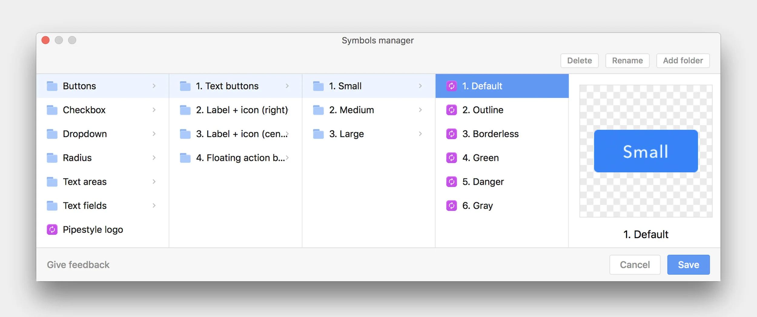
Symbols Manager enabled us to test different sets of component folder quickly and effortlessly.
Measuring design system success and next challenges
We set adoption, measured as the amount of the app’s code base that is actually composed of Pipefy Style components as our North Star metric for the design system. On the design team side, we used our design critique session to assess library adoption, consistency, and also to review any additional components for the next phases of the project.
Nexts steps (and challenges) are, obviously, expand the scope of design system to more components used throughout the product, increase system's adoption, and define system's team structure (centralised, fully dedicated resources or not).
Experiments framework
Goals
In a short sentence, we are ultimately looking for the keys to growth, but we're also want to give everyone’s ideas an opportunity to create impact. The idea of having a standardized process and Kanban is to centralize all of our findings, so product and design teams can more easily spot trends in experiment results, iterate on tests and drive larger product decisions based on our findings, that would eventually drive activation rates up, our most important metric.
Prioritizing, running and measuring success
Product and design teams are be responsible for managing the backlog of ideas on a regular basis. Priority to experiments are assigned based on estimated potential impact, confidence in success and ease of implementation, what is commonly known as ICE score.
Once prioritized, product team assign the engineering team responsible for building and running the experiment. The experiment then is scoped and included in the team’s sprint and deployed as soon as it is ready to go, currently we're dedicating roughly 50% of our engineering capacity in developing experiments.
Once deployed, growth manager will be responsible for keeping track of what is running. The experiments duration varies accordingly to their nature and type of data required to define it as done
Analysis should be primarily completed by the experiment owner, with the help of product team. All results are discussed by owners and product and design team to declare the experiment as a winner, loser or inconclusive.
Experiment 1: Find out the users pain points

Description
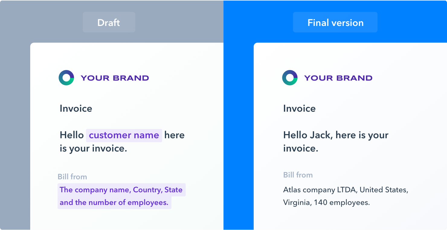
To survey customers at the beginning of the signup flow to understand the pain points they are trying to solve. The experiment goal was to measure if asking customers to answer a pain point survey would affect the customer's motivation to signup, this data would hypothetically allow us to tailor the onboarding flow.
Results
• Target Metric - 0% decrease in users signing up and reaching the org dashboard
• Actual Result - 5% increase (from 26% to 27.3%)
Next steps
• Implement the pain point survey
• Use the answers to customize the onboarding flow
• Try to move the survey to other parts of the signup flow
• AB test answers in the pain point survey
Experiment 2: Sample cards on popular Pipe templates
Description
This test consisted in displaying sample cards populating the Pipe screen (Kanban) on the most popular templates of Pipefy. Previously, users would just see one card at the end of the onboarding tour, in case user completed the tour successfully. The test wanted to prove that having sample cards in Pipefy templates helps users better understand and use the product.
Results
Target Metric - 20% increase in users creating 5 cards in the first 7 days
Actual Result - 16% increase, from 8.61% (Nov 2018) to 9.99% (Dec 2018)
Notes - Control group (templates without sample cards) went from 15.27% (Nov 2018) to 13.41% (Dec 2018)
Next steps
Add sample cards to all templates
A/B test sample cards
Make sample card content look more like sample content (e.g. Sample Company A vs. Amazon)
Experiment 3: Moving notifications notifications down the line

Description
Move the prompt for browser notifications to after the user finishes the Pipe tour to get a higher opt-in rate. Previously, the prompt was shown immediately when you land on the company dashboard. The test wanted to prove that users are more likely to opt-in given the right context as to why a notification is useful, even with one more click friction.
Results
Target Metric - 20% increase in opt-in rate over the average web push notification opt-in rate (15%)
Actual Result - 29% increase in opt-in rate
Next steps
• Find other opportunities to ask for opt-in
• Changing the opt-in location for all users
• Asking for opt-in at other points in the experience
Experiment 4: Learning content for report feature

Description
Display a carousel of content that explains the value of company reports to the first time user who have not yet created any reports. Carousel would help to explain the value of reports making the users who view it more likely to start to use Pipefy. We wanted to prove that for features that cannot be used until certain prerequisites are met, users need to be guided more towards understanding the value of Pipefy and how to unlock the value of the feature.
Results
• Target Metric - 50% of users view all carousel slides
• Actual Result - 44.93% of users viewed all slides
• 14.17% of user who viewed all slides created a report (7.8% of all users), control group had a 4.1% report creation rate
• Users are willing to engage with the carousel to learn more about the feature
Next steps
• Keep the carousel content due to its relatively good performance
• Create engaging, content based experience on the complex feature of Pipefy